
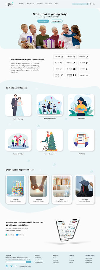
About Giftizi
Giftizi is an online registry website that allows users to create gift registries from different stores.
With Giftizi, users can create one registry to manage all of their gifts, and also allows them to share their registry with others.

Project Overview
As a student at UX Land, I was assigned to design an adoptive registry website for mobile and desktop with this detail:

Team
Group of 4

Tools
Miro, Figma

Duration
4 weeks

Role
UX/UI Designer, Researcher
Business Needs
-
Having an e-commerce website that allows users to create a convenient wish list from different platforms to sell products.
-
Provide customers with the ability to save their wish list and share it with friends and family.
-
Promote the message that creating an online wish list and making purchases from it is easy and accessible to everyone.

Potential Users:
1- Users who create wish list
2- Users who buys gifts from wish list
In this Project we work on users who Create a wish list.

Goals
-
Giving users a friendly and authentic feeling when it comes to website to create a wish list or buy a gift.
-
Easy to follow the process for creating a wish list.
-
Easy and fast access to choose gifts form different platforms for creating a wish list.
-
A minimal website with a simple purchase process for gift buyers.
My Design Process
Our design consisted of 4 phases:
Note: there is no doubt that iteration is necessary during all phases.

-
Survey
-
Interview
-
Affinity Diagram
-
Competitive Analysis
-
Persona
-
Site Map
-
User Flow
-
Sketches
-
Wireframe
-
Mood Board
-
Ui Kit
-
Useability Testing
-
High Fidelity Prototype
Discover
Survey
Initially, we conducted a survey to obtain a broad understanding of the difficulties and requirements people face when purchasing gifts online or generating an online wish list. The survey received responses from 60 individuals, and the most findings of the research indicate:

-
53% of people prefer to view more product information without having to click.
-
67% can see everything in filters and save time, while 33% prefer to browse more extensively.
-
84% More options to choose.
Interviews
To gain insights into the process of creating an online wish list and the difficulties encountered while compiling a gift list, we conducted interviews with 5 individuals. Our approach involved asking open-ended questions and encouraging them to share their thoughts and experiences. This proved to be one of the most informative segment of our research and proved invaluable in guiding our design process.
Affinity Diagram
We organized the information we got from the interviews Using the Affinity diagram.


Interviews & Affinity Diagram Takeaways:
-
Seeing more information in one look.
-
Accessing more products from one platform.
-
Having a filter option.
-
Being able to manage a wish list.
Competitive Analysis
As part of our research and planning process, we conducted a thorough investigation to gather information about similar businesses in our industry. To accomplish this, we conducted a competitive analysis by exploring various websites and their features, with the aim of gathering insights and inspiration that we could use to improve our own business plan. By conducting this analysis, we were able to gain a deeper understanding of our market and identify areas where we could differentiate ourselves from our competitors.
Home page

Major Competitive Analysis Takeaways:
-
Easy access to sign up/log in, editing a wish list.
-
Website suggestions and wide range of gift options differentiate from competitors.
Define
Personas:
We wanted to form a deeper understanding of our users' goals, needs, experiences, and behaviors. So, we created a personas based on user research, and we kept updating them throughout the project as we gathered more data. We used these personas whenever we wanted to step out of ourselves and reconsider our initial ideas:

Site Map:
Based on our findings, we have created the site map. As can be seen according to research gift options are categorized based on occasions in order to make it easier to create a wish list.

Sketches
Always sketching gives me an insight into my design and helps me to create user story, site map, and user flow.

User Flow:

Mid Fidelity Wireframes
Here are the initial wireframes presenting what we discovered as critical information on the homepage, website idea page, and create and share link page.

Mood Board
While creating the mood board, we were inspired by nature, flowers, plants, gifts, water, light and peoples' happiness. Based on the mood board, I chose teal as the primary color.

UI Kit
Finally, having applied the Giftizi layouts defined in the mid-fidelity wireframes, we created a UI Kit. This is a living document that can serve as a resource, ensuring that the visual design remains consistent as the website is further developed.
In designing the following aspects are considered:
-
Selecting the Teal color inspired by nature, flowers, plants, gifts, water, light and peoples' happiness.
-
Applying the Helvetica typography to follow the minimal design in order to inspire the feeling of simplicity.
-
Applying a sufficient amount of white space to create a minimal design and a feeling of simplicity.

Before

Iteration 1:
Home Page Changes
After
Add CTA Button For Mange a Wish List
Add Inspiration Section
We discovered through our surveys and interviews that users want the CTA button for manage their wish list to be visible on the first page. Therefore, we have included this button within the hero image.
Additionally, we have introduced an inspiration section to assist users who may be uncertain about their exact needs and require some suggestions.
Iteration 2:
Add Two More Pages
Before
Homepage

Product page

Add Suggestion pages to narrow down their choices
Homepage
After
Suggestion page 1

Suggestion page 2

Product page
We noticed that users had trouble finding items they wanted to add to their wish lists during our tests and observations. So, we're adding two new pages to help them out. There will be a suggestion page and another page based on their choices from the suggestion page. These extra pages will make it easier for users to narrow down their preferences and find what they want faster. Our goal is to make the wish list creation experience on our website better and smoother for users.
Iteration 3:
Add Detailed Filters
Before

After

Add Detailed Filter On The Left Side Of The Product Page
Four Additional Filters At The Top.
Initially, our product page didn't have filters. Users had to rely solely on the suggestion page for their choices. But after conducting interviews, surveys, and usability tests, we realized they needed more filters beyond what the suggestion page offered. As a solution, we added a detailed filter on the left side of the product page, along with four additional filters at the top.
Deliver

Learnings
-
Great achievements often begin with small steps, and when challenges arise, solutions can be found.
-
I discovered that there is always something new and exciting to learn.
-
Designing your work to perfectly meet the needs of both users and the business is crucial.
-
Learning how to be a UX/UI designer for the first time was an invaluable experience.
Thank you for reading my case study!
Want to work with me? Feel free to contact me!
...or just say hello on my social media.
Other Projects


%201.png)
The Cove club
Redesigning a website for a Michelin Star restaurant
Role: UX/UI Designer, Researcher


Payeh
Designing an app for finding walking partners
Role: UX Researcher